Medic

Role / Services

User Research, Interaction, Visual design, Information Architecture, Prototyping & Testing

Role / Services

User Research, Interaction, Visual design, Information Architecture, Prototyping & Testing

Role / Services

User Research, Interaction, Visual design, Information Architecture, Prototyping & Testing

Year

May 2022 - Oct 2022

Year

May 2022 - Oct 2022

Year

May 2022 - Oct 2022

Company

Peol Technologies

Company

Peol Technologies

Company

Peol Technologies

Overview

Imagine managing your health with just a tap on your phone. The Medic App simplifies healthcare by combining essential features like booking appointments, making payments, and accessing remote consultations all in one platform. Users can easily chat with doctors, make video calls for quick diagnoses, and review medical records securely.

This online doctor appointment app aims to provide a seamless experience for both patients and healthcare providers. With a user-friendly interface, patients can conveniently view doctors' profiles, check availability, and book appointments effortlessly.

The problem

— Long Wait Times: Patients May Have To Wait For Weeks Or Even Months To Get An Appointment With A Specialist, Causing Delays In Getting Necessary Medical Treatment.

— Difficulty In Scheduling Appointments: Some Patients May Have Difficulty Scheduling Appointments Due To A Lack Of Knowledge About The Healthcare System Or Difficulty Navigating The Scheduling Process.

— Limited Access To Specialists: Some Patients May Live In Areas With A Shortage Of Specialists, Making It Difficult For Them To Get The Care They Need.

— Limited Hours Of Operation: Some Hospitals May Have Limited Hours Of Operation, Making It Difficult For Patients To Schedule Appointments Outside Of Regular Business Hours.

— Overcrowding: Some Hospitals May Be Overbooked, Leading To Long Wait Times, Delays In GettingTreatment, And Patients Turned Away.

— Emergencies: Some Hospitals Are Overwhelmed With Emergencies And May Not Be Able To TakeAppointments.
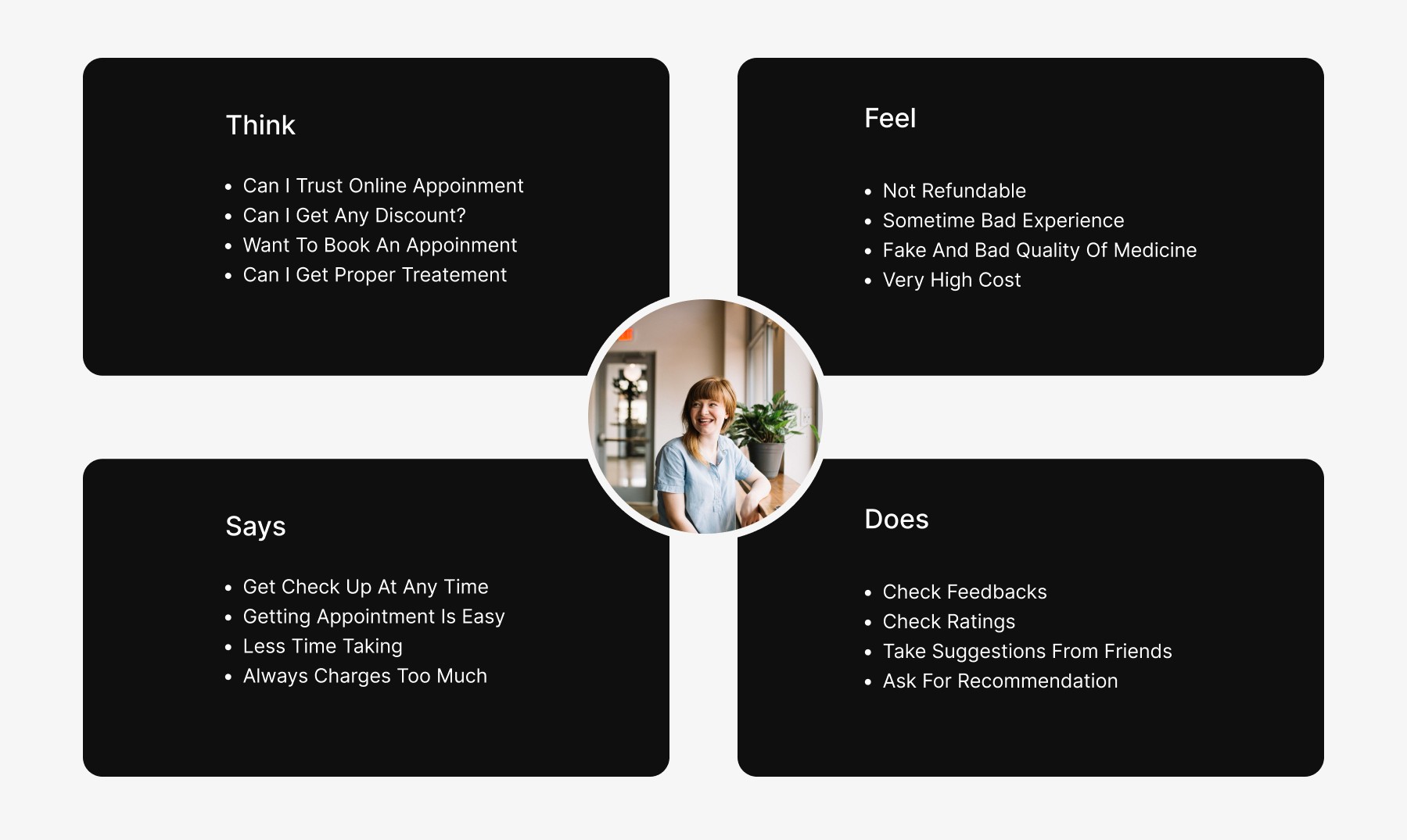
User Research

To design the Medic App in a way that truly meets user needs, it was essential to understand the pain points of both patients and healthcare providers. The research process was in-depth, involving interviews and surveys with potential users to gain insight into their daily healthcare struggles and expectations from such an app.

We focused on gathering qualitative insights from a diverse group of users ranging from patients seeking specialist appointments to doctors managing busy schedules. These findings were critical in shaping the app’s features, especially when it came to streamlining appointment booking and offering remote consultation options.

Here’s what we uncovered:

— Patients wanted convenience: They expressed frustration with long wait times, limited access to specialists, and the complexity of booking appointments.

— Doctors sought better time management: Many highlighted the challenge of managing their appointments while keeping patient communication streamlined and efficient.

— Tech comfort varied: While some users were tech-savvy and welcomed a digital-first approach, others preferred simpler, intuitive interfaces to guide them through the process.

User Profiles

The Medic App is designed to cater to various user profiles, each with distinct pain points:

  1. The Student

Age: 18-25 | Tech Comfort: High | Location: Bangalore

  • Time Constraints: Struggles to find time for health appointments amidst academic responsibilities.

  • Flexibility Needs: Limited availability makes scheduling traditional appointments challenging.

  • Health Management: Difficulty keeping up with routine health check-ups due to a busy schedule.

  1. The Office Worker

Age: 25-40 | Tech Comfort: Moderate | Location: Bangalore

  • Limited Time: Often has to schedule appointments during short breaks or after work, leading to frustration.

  • Forgetfulness: Frequently misses follow-ups and medication reminders due to a hectic work life.

  • Record Management: Faces challenges managing health records and insurance details without a centralized tool.

  1. The Business Man

Age: 30-50 | Tech Comfort: Moderate to High | Location: Bangalore

  • Scheduling Conflicts: Has difficulty finding time for health appointments due to travel and meetings.

  • Convenience: Prefers efficient solutions like video consultations but may struggle with accessing reliable options.

  • Wellness Maintenance: Finds it hard to track health metrics and maintain wellness in a busy schedule.

Empathy Map

This empathy map provides insights into the thoughts, feelings, statements, and actions of users, helping guide the design and development of the Medic App to better meet their needs and address their concerns.

Empathy Map

This empathy map provides insights into the thoughts, feelings, statements, and actions of users, helping guide the design and development of the Medic App to better meet their needs and address their concerns.

User Flow

A User Flow Is A Visual Representation Of The Steps And Actions A User Takes To Complete A Task On A Website Or Mobile App, Mapping Out Their Journey Through The Product And Helping To Identify Problem Areas In The User Experience

User Flow

A User Flow Is A Visual Representation Of The Steps And Actions A User Takes To Complete A Task On A Website Or Mobile App, Mapping Out Their Journey Through The Product And Helping To Identify Problem Areas In The User Experience

Insights

After conducting extensive user interviews and contextual inquiries, I delved deep into the data to uncover insights that would shape the Medic App. The findings illuminated three crucial themes:

— Trust in Healthcare
Users expressed a fundamental need for trust when it comes to online medical consultations. They emphasized the importance of having verified doctor profiles and authentic patient reviews, ensuring confidence in their healthcare choices.

— Simplified Appointment Scheduling
The data revealed that a seamless booking experience was essential for users, particularly for those juggling busy schedules. They craved an intuitive process that made scheduling appointments quick and hassle-free.

— Preference for Remote Consultations
Lastly, many users showed a strong preference for remote consultations, valuing the convenience of accessing healthcare from the comfort of their homes. This was especially true for routine check-ups, where ease and accessibility were paramount.

Conceptualization

Building on user insights from the research phase, I began crafting the information architecture and low-fidelity concepts for the Medic App, focusing on key use cases. After presenting initial mockups to the Product Manager, developers, and stakeholders, we gathered valuable feedback that informed our next steps.

We conducted usability testing with the low-fidelity designs, allowing us to refine the user experience through real-time observations. With confidence in our design direction, we moved forward with digitalizing the mockups, laying the groundwork for an engaging interface.

Connect to Content

Add layers or components to infinitely loop on your page.

Product Page

The Product page on Filla provides users with all the information they need to make confident purchasing decisions. Users can browse multiple images, check reviews, and easily select product options like size and color. Detailed descriptions cover essential details such as materials and eco-friendliness, ensuring transparency. Features like the Add to Cart button, product tags, and the ability to share on social media make the shopping experience both personalized and convenient.

The Product page on Filla provides users with all the information they need to make confident purchasing decisions. Users can browse multiple images, check reviews, and easily select product options like size and color. Detailed descriptions cover essential details such as materials and eco-friendliness, ensuring transparency. Features like the Add to Cart button, product tags, and the ability to share on social media make the shopping experience both personalized and convenient.

Connect to Content

Add layers or components to infinitely loop on your page.

Connect to Content

Add layers or components to infinitely loop on your page.

Connect to Content

Add layers or components to infinitely loop on your page.

Product Page

The Product page on Filla provides users with all the information they need to make confident purchasing decisions. Users can browse multiple images, check reviews, and easily select product options like size and color. Detailed descriptions cover essential details such as materials and eco-friendliness, ensuring transparency. Features like the Add to Cart button, product tags, and the ability to share on social media make the shopping experience both personalized and convenient.

Connect to Content

Add layers or components to infinitely loop on your page.

User Research

To ensure the New ERP System would address the real needs of HR teams, we began by conducting extensive user research. The goal was to deeply understand the pain points of HR professionals and how a centralized system could improve their daily workflows.

Surveys and Interviews: We started with online surveys to gather quantitative insights into how HR teams manage tasks like payroll, staff management, and logistics. This data helped us identify key problem areas, such as inefficiencies caused by using multiple systems. Following the surveys, we conducted one-on-one interviews with HR managers and staff. These sessions offered a deeper look into their frustrations, such as manual data entry, poor communication between departments, and difficulties accessing critical information in real time.

Competitor Analysis: We also performed a competitor analysis to understand the strengths and weaknesses of existing ERP solutions in the market. This allowed us to identify gaps where the New ERP System could stand out—particularly in terms of user experience and ease of integration with existing workflows.

Key Insights: Our research revealed that HR teams were eager for a tool that not only centralized their operations but also simplified their processes, reduced manual tasks, and facilitated better communication. Based on these findings, we shaped the development of the New ERP System to ensure it would effectively solve these problems while being intuitive and easy to use.

Insights

After conducting countless user interviews, contextual inquiries, and analyzing the gathered data, I categorized the insights into three key areas:

Lack of Centralized Information:
HR teams struggle with scattered data across multiple systems, leading to inefficiencies in staff management, payroll, and communication. A unified platform is essential to streamline processes and improve workflow management.

Communication Gaps Across Departments:
A recurring issue is the delay in decision-making caused by poor communication between departments. HR staff emphasized the need for real-time updates and seamless communication to ensure they are always equipped with the latest employee information.

Manual Processes Create Bottlenecks:
Tasks like approving leave requests, managing payroll, and handling circulars are often manual and prone to errors. Automating these processes would free up time for HR teams to focus on more strategic activities, reducing stress and improving overall productivity.

The Solution

The New ERP System simplifies HR operations by centralizing key functions like staff management, payroll, and communication. It reduces inefficiencies by providing real-time updates and automating tasks, allowing HR teams to handle their responsibilities with greater speed and accuracy. This streamlined approach minimizes errors and eliminates manual bottlenecks.

With an intuitive, user-friendly design, the system ensures smoother collaboration across departments. Real-time communication helps avoid delays in decision-making, while built-in reporting tools offer valuable insights for better workforce planning. Overall, the system improves productivity and empowers HR teams to focus on more strategic initiatives.

Designs

With the New ERP System project, I focused on creating a clean, minimal user interface that enhances functionality while remaining intuitive. Given the time constraints, I rapidly developed mockups for key user journeys, ensuring smooth navigation across critical HR functions such as payroll, staff management, and notifications.

To streamline the process, I built an interactive prototype in Figma, allowing stakeholders and developers to explore and provide feedback on the design. This prototype was essential in refining the user experience and ensuring alignment with project goals before moving into full development.

Secure Login Experience

Ensure a secure login experience with clear input fields for username and password, allowing users to access the New ERP System safely while maintaining data protection and privacy.

Comprehensive HR Overview

The dashboard provides HR managers with an at-a-glance overview of key metrics like staff count, application trends, and department data. Visual indicators, such as growth arrows, make it easy to track performance without needing detailed reports.With features like a scrollable memo section, a staff list with procurement requests, and a pie chart for application statuses, the dashboard streamlines management tasks. This centralized interface helps users make informed decisions quickly and efficiently.

Staff Management Made Easy

The Staff page provides a streamlined way to manage employee data. Users can quickly search for staff, apply filters, and add new team members with ease. The top section displays the total number of staff, a search bar, filter options, and an “Add New Staff” button.

In the main content area, staff details are displayed in a table format, featuring information like first and last names, gender, staff ID, designation, and actions such as "View" or "Edit." The page also supports easy pagination and scrolling for smooth navigation through large datasets, allowing users to view or update staff details efficiently.

Streamlined Payroll Management

Navigating the complexities of employee compensation can often be daunting for HR professionals. The Payroll page transforms this experience, providing a clear and concise overview of crucial financial metrics such as gross and net salaries, total taxes, and loans. With everything laid out at a glance, HR can quickly assess the organization’s payroll status, allowing for timely adjustments and informed decision-making that aligns with company policies.

As HR teams dive deeper into the Payroll page, they find an intuitive layout that simplifies navigation. The annual payroll summary bar graph vividly illustrates salary distributions, taxes, and loans, facilitating rapid evaluations of the organization’s financial health. With the power to create salary definitions, generate payslips, and edit entries directly, HR staff can manage payroll processes effortlessly. This streamlined approach not only reduces administrative burdens but also empowers HR to focus on strategic initiatives that drive organizational growth.

Efficient Circular Management

The Circular section acts as a centralized hub for managing essential organizational communications. HR professionals can quickly search for specific circulars, filter through existing ones, and add new circulars with ease, ensuring that all critical announcements are accessible for improved transparency. With a clear display of each circular's title, sender, recipient, date, type, and actionable options, HR teams can efficiently track and manage communications. This streamlined layout enables quick creation of new circulars, keeping employees informed and fostering a cohesive workplace environment.

Streamlined Maintenance Management

The Maintenance page serves as a pivotal tool for HR and operational teams, centralizing the management of scheduled maintenance activities. At the top, users are greeted with clear indicators of scheduled, completed, pending, and overdue maintenance tasks, each accompanied by helpful arrows and status information to keep everything organized at a glance.

Diving into the main frame, users can effortlessly schedule new maintenance tasks by selecting dates from an interactive calendar and entering relevant details. This functionality not only ensures that maintenance activities are timely and well-coordinated but also allows users to attach payment invoices, streamlining the financial aspect of maintenance management. This intuitive layout fosters a proactive approach to facility upkeep, enhancing overall operational efficiency.

Streamlined Logistics Management

The Maintenance page serves as a pivotal tool for HR and operational teams, centralizing the management of scheduled maintenance activities. At the top, users are greeted with clear indicators of scheduled, completed, pending, and overdue maintenance tasks, each accompanied by helpful arrows and status information to keep everything organized at a glance.

Diving into the main frame, users can effortlessly schedule new maintenance tasks by selecting dates from an interactive calendar and entering relevant details. This functionality not only ensures that maintenance activities are timely and well-coordinated but also allows users to attach payment invoices, streamlining the financial aspect of maintenance management. This intuitive layout fosters a proactive approach to facility upkeep, enhancing overall operational efficiency.

Dynamic Budget Oversight

The Office Budget page transforms financial management into a seamless experience for HR professionals. Users can effortlessly track the total annual budget, current spending, and remaining balance, ensuring clarity on financial resources at a glance.

With detailed budget histories and the ability to create new budgets and submit requests for approval, this page empowers HR to make informed decisions. This streamlined approach not only enhances transparency but also fosters a culture of fiscal responsibility within the organization.

Streamlined Stock and Inventory Management

The Stocks and Inventory page serves as a vital resource for HR professionals, providing a comprehensive overview of organizational assets. Users can quickly assess total items, associated costs, and low-stock alerts, ensuring that resources are managed effectively.

With the ability to toggle between stock and inventory views, HR teams can easily navigate detailed listings, including unit counts, pricing, statuses, and supplier information. This functionality not only simplifies the process of updating records but also empowers HR to maintain optimal inventory levels and respond proactively to supply needs.

Efficient Notification Management

The Notifications page is designed to keep HR professionals informed and engaged with real-time updates. Users can effortlessly view all notifications, with a clear distinction between today's and yesterday's alerts, complete with timestamps for easy reference.

By marking notifications as read, HR teams can maintain an organized overview of important communications. Each notification can be clicked for detailed information, ensuring that critical messages from HR are readily accessible and actionable. This streamlined approach enhances communication and helps foster a responsive workplace environment.

Streamlined Procurement Management

The Procurement page serves as a vital tool for HR professionals, providing a comprehensive overview of all procurement activities. At the top, users can easily track total requests made, costs incurred, and the status of pending and approved requests, each accompanied by clear indicators for quick assessment.

In the main content area, HR can view detailed procurement requests, including item quantities, recipients, requesters, dates, and statuses. With the ability to create new procurement requests and attach payment vouchers, this page simplifies the approval process. Clicking on any procurement request reveals a detailed view, complete with a submission form for HR to add remarks. This efficient setup enhances oversight and facilitates seamless procurement operations.

Usability Testing (In Progress)

Usability Testing (In Progress)

Usability testing is being conducted throughout the development of the New ERP System to ensure an intuitive and efficient user experience:

— Lo-fi Prototype Testing – Regular sessions with stakeholders focus on assessing functionality, navigation, and design concepts. Feedback gathered from these sessions is actively being used to refine early-stage prototypes.

— Unmoderated User Testing (Planned) – Once mid-fidelity prototypes are developed, selected users will engage with the system to complete tasks such as managing payroll, scheduling maintenance, and generating reports. This will help uncover usability challenges in real-world scenarios.

— Beta Testing (Upcoming) – Prior to the official launch, beta testing will be carried out with a targeted group of HR professionals. This phase aims to resolve any outstanding issues related to user interaction, performance, and accessibility.

Note: As the product is still under development, usability testing is ongoing. Initial feedback has been incorporated into the design, and further results will be collected and analyzed as testing phases progress.

Project Learnings

  1. Emphasizing User-Centric Design
    Understanding the end-user experience is paramount. Throughout the development of the New ERP System, engaging with HR professionals highlighted the importance of crafting solutions that directly address their pain points. By prioritizing user needs, we can ensure that the final product is not only functional but also intuitive.

  1. Iterative Feedback is Key
    Continuous feedback loops with stakeholders and users have proven invaluable. Regular testing and reviews allow for timely adjustments, enabling the team to stay aligned with project goals and user expectations. Embracing this iterative process fosters a culture of collaboration and innovation.

  1. Adaptability Drives Success
    The complexity of an ERP system requires flexibility in approach. Being open to modifying design concepts and functionalities based on user insights ensures that the product remains relevant and effective. This adaptability ultimately leads to a more robust solution that can evolve with organizational needs.

The Solution

To solve the challenges identified, we focused on creating a streamlined, intuitive experience for users across all touchpoints of the Medic App. The design emphasizes quick access to essential features like booking doctor appointments, making payments, and managing remote consultations. We introduced an easy-to-navigate interface where users can manage medical records, chat with doctors, and handle personal details efficiently.

Key solutions included:

  • Simplified appointment booking and consultation process.

  • Secure, integrated payments system.

  • Personalized medical profiles for easy record access and updates.

  • Time-saving for Patients

  • Easy Appointment Scheduling

  • Access to Specialists

  • 24-hour Appointment Options

  • Emergency Services

  • Convenient Appointment Management

Designs

With the Medic App, the primary goal was to create a user-friendly interface that simplifies complex medical tasks while ensuring a seamless experience. The clean and minimal design ensures that even less tech-savvy users can navigate the app with ease.

I rapidly developed mockups for key user journeys, focusing on essential tasks like booking doctor appointments, accessing medical records, and video consultations. These designs were iterated upon based on feedback from stakeholders and usability testing to refine the user experience.

The final interactive prototype in Figma allowed stakeholders to explore the design, and it served as a crucial step before moving into development.

Get started screen

This screen was simply created to showcase our logo and encourage users to click on the button to get started.

Register account

Users can quickly register via Facebook or Gmail, with a 'Forgot Password' option for easy recovery, ensuring a smooth sign-up process.

Home page

Upon entering the Medic App, users are greeted with a user-friendly interface designed for easy navigation. At the top left, their profile picture and name offer quick access to personal details. To the right, a notifications bell keeps them updated on important alerts.

A prominent search bar allows users to easily find doctors, while a carousel displays vital health information. Below, users can browse categories like dentists, therapists, and surgeons. The comprehensive doctor list features profiles, ratings, and a favorite button for quick access. Navigation between pages is seamless, with an intuitive bottom bar guiding their journey.

All Doctors Page

On the "All Doctors" page, users can effortlessly search for healthcare professionals using both a text search bar and voice memo options. This functionality ensures quick access to the right doctor, tailored to their needs.

Each doctor is displayed with their profile picture, specialty, and ratings, providing a clear overview of available options. Users can easily add their preferred doctors to their favorites with a simple click of a button, ensuring that their go-to choices are always at hand. Centrally located is the main "Book" button, inviting users to schedule appointments with their selected specialists seamlessly.

Appointment Details Page

Upon selecting a doctor, the "Appointment Details" page opens, providing all the essential information at a glance. The doctor's photo, name, specialty, and consultation charges are prominently displayed at the top, alongside options for communication chat, call, or video call.

Below this, users can view detailed information about the doctor, including qualifications and experience. To book an appointment, users simply choose their preferred date and time. After clicking the "Book Appointment" button, they are redirected to a calendar page to finalize the details. Once the time is set, they can confirm the appointment by hitting the "Set Appointment" button. Users can also access this page directly from the homepage by selecting a doctor and choosing the date and time.

Payment Page

After selecting the appointment date and time, users are seamlessly redirected to the "Payment Page." Here, the total amount for the consultation is displayed prominently at the top. Below this, users have the option to pay by entering their card details or choosing a convenient UPI payment method.

Once the payment is successfully processed, the appointment is officially booked, providing users with confirmation and details about their upcoming consultation. The smooth transition from booking to payment ensures a hassle-free experience.

Messaging Page

The "Messaging Page" offers a simple and intuitive chat system, allowing users to search for doctors easily. At the top, users can view the number of available and inactive doctors. Once a doctor is selected from the chat section, the interface is straightforward, minimizing any confusion.

At the top-right corner, there are call and video call icons, enabling users to initiate voice or video consultations directly from the chat.

This streamlined design ensures that users can communicate with doctors effortlessly, maintaining focus on their health needs.

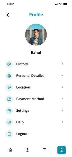
Profile and Notifications Pages

The Profile Page is accessed by clicking on the user's photo from the homepage. Here, users can update their profile picture, modify personal details, review their appointment history, and update location preferences. It also offers easy access to payment methods, app settings, help, and a logout option, ensuring full control over personal information.

On the Notifications Page, users stay connected with timely reminders about upcoming doctor appointments, medication schedules, and health check-ins. The app also sends updates on new doctor messages, medical records, and personalized health tips, helping users stay on top of their healthcare journey effortlessly.

Usability Testing

— Throughout the development of the Medic App, user feedback has been essential in shaping its design. We began with initial testing of low-fidelity prototypes, gathering insights from users on navigation, functionality, and overall user flow. These early tests allowed us to identify potential issues and refine key elements before advancing to the next phase.

— As we progressed, we prepared for unmoderated user testing, where selected users interacted with mid-fidelity prototypes. By completing tasks such as booking appointments, messaging doctors, and navigating their profiles, we aimed to uncover usability challenges that might arise in real-world scenarios.

— The final stage will involve beta testing with a broader audience to ensure the app is intuitive, accessible, and effectively meets diverse healthcare needs before the official launch. Feedback from each stage will continue to inform the design process, enhancing the user experience and ensuring the app caters to every patient's journey.

Results and Takeaways

Working on the Medic App was an enriching experience, full of challenges and rewarding insights. The project highlighted the importance of user-centered design, especially in a field as sensitive as healthcare. Here are some key takeaways:

— Streamlined Experience is Essential
Users greatly valued having a single platform to manage all their healthcare needs. The consolidation of appointments, consultations, and medical records into one app drastically improved their overall experience.

— Ease of Use is Key to Engagement
The simpler we made the navigation and booking processes, the more engaged users became. Complex systems only caused frustration, while an intuitive design fostered trust and long-term use.

These learnings will continue to influence how we design future iterations, ensuring that the Medic App remains a powerful tool for both patients and healthcare providers.

Overview

Imagine managing your health with just a tap on your phone. The Medic App simplifies healthcare by combining essential features like booking appointments, making payments, and accessing remote consultations all in one platform. Users can easily chat with doctors, make video calls for quick diagnoses, and review medical records securely.

This online doctor appointment app aims to provide a seamless experience for both patients and healthcare providers. With a user-friendly interface, patients can conveniently view doctors' profiles, check availability, and book appointments effortlessly.